It is hard to believe it has been more than a year now since Google released it’s Mobilegeddon algorithm. Google had been warning us for years already to be mobile friendly… so much so that we had been talking to our customers about it for a long time already! And truth be told, the majority of our customers are already mobile responsive…. But I am still surprised when I come across a new customer/prospect and their website is not Mobile (yes, it still happens!) This, even though the Google Algorithm, Mobilegeddon hit April 21, 2015!
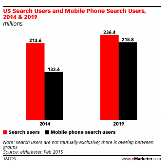
It was very rare that Google had chosen to give forewarning to this new algorithm. (announcement ) This is because Mobile is so important to Marketing today. Did you know that the average person checks their phone more than 150 times/day? 75% of mobile conversions take place within 1 hour of the search and in September 2015 Google announced that Mobile searches had officially surpassed desktop searches!
Past algorithms, starting with Google Panda, a change to Google’s search results ranking algorithm, first released in February 2011, hit webmasters hard! Panda, dealing with issues of duplicate or “copied” content, a filter that prevents low quality sites and/or pages from ranking well in the Search Engine Results page & affects the ranking of an entire site or a specific section rather than just the individual pages on a site. The Panda algorithm was realized without warning…. After Panda we were hit with Penguin, then Hummingbird and so on….. Truly a Google Zoo!
Given that this time we did have warning – why are there still so many non-mobile sites? In the field there is still a lot of debate about having a separate mobile design vs. mobile responsive sites. At DMX we have chosen the option of mobile responsive sites (this is standard in to all new website designs). This algorithm is not just about whether or not a website can be read on mobile – it is also about the use of apps & more relevant app content in search results ie., surface content from indexed apps.
Still confused about what this update is all about? Here are a few simple tests you can do!
1. Test your website using Google’s very own Mobile Friendly Test:
https://www.google.com/webmasters/tools/mobile-friendly/
2. Test your website using Google speed test
https://developers.google.com/speed/pagespeed/insights/
3. Check Google Webmaster Tools for any mobile usability errors
https://www.google.com/webmasters/tools/mobile-usability
Once you have tested your site you will have an idea of whether or not your site is mobile compatible, and an idea of whether or not you may be hit by this latest Mobilegeddon algorithm. Why is any of this relevant? Mobile device use has become the norm. Most households boast 3+ mobile devices per home! And mobile devices allow for greater flexibility in search and demographic targeting! According to eMarketer, because of mobile searches, marketers have moved on from keyword to secondary search signals. The article is here .

Still confused about what all this means? We are here to help you understand Google speak and to navigate the best online marketing campaign for your target market! Contact Us today to find out if your site is indeed mobile responsive and ready for the Mobilegeddon algorithm!


